A charity in Edinburgh

Their website looked tired.
That was the least of it.

Three things were quietly costing them supporters, and none of them were visible by looking at the site. Here's what I found, in plain English.

What was wrong

Three quiet problems

People kept trying to get in touch — and were shown an error page.

The staff email addresses on the site had been typed in slightly wrong. So when somebody read about a course, decided to make contact and clicked the address, they didn't get an email window. They got "page not found".

Most people don't try twice. They assume nobody's there.

Now Every address on the site opens an email properly.

Illustration: letters being posted through a letterbox that has no box behind it, piling up unseen on the floor

Google was reading thousands of blank pages instead of the real ones.

Their events calendar had been quietly creating a new, empty page for every date it could think of — years into the past and the future. Google found four times more pages than the charity actually has, and gave up on hundreds of them.

Search is how most people find this charity — it brings in far more visitors than Facebook was sending them. So this mattered.

Now Pages exist because somebody wrote them. Nothing is manufactured.

Illustration: a noticeboard smothered under dozens of blank sheets, with one real poster buried underneath

Almost nobody visiting the website was a person.

The site looked busy. It wasn't. Nearly all of that activity was automated software — most of it trying to break in. Underneath the noise, the real audience was a small fraction of what all that activity suggested.

Nobody knew how small that audience was, because nothing was measuring it.

Now They can see their real visitors, week by week — and the new site has no back door to break into.

Illustration: a crowd of hollow, faceless outlines with a single solid human figure among them

What I did

Then I rebuilt the website

Every page — about 300 of them, ten years of events and stories — moved across and given a modern design. Tap a marker to see the thinking behind each part.
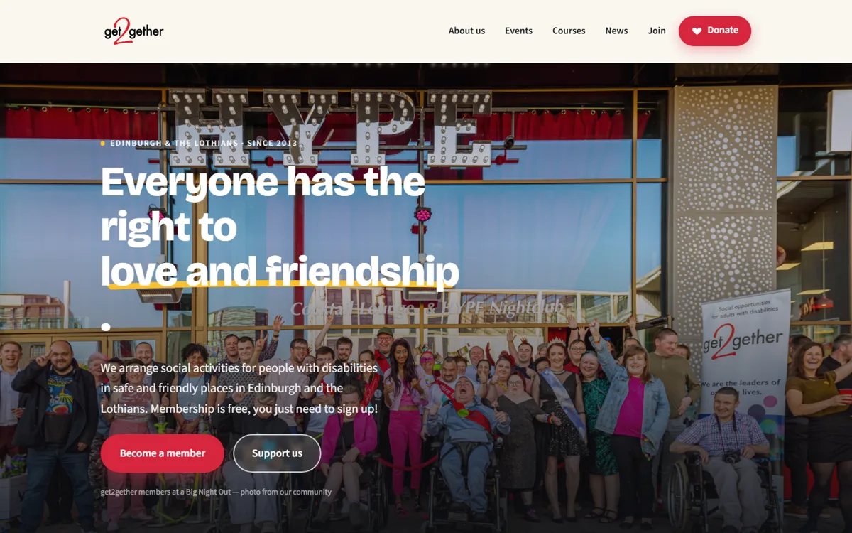
The rebuilt homepage, with five numbered markers explaining each decision
  1. 1A menu you can actually scan

    The old one had grown a heading for every project since 2013. This one holds the five things people actually arrive looking for. Everything else is still there, one click further in.

  2. 2Donate never disappears

    It stays in the corner as you scroll, on every page. Giving shouldn't mean going to find the giving page first.

  3. 3One sentence, in their own words

    A first-time visitor knows what this charity is before they scroll. A large share of visits to the old site never got past the first screen.

  4. 4Two things to do, not eight

    Join, or support. Those are the only two things a stranger can usefully do when they arrive, so they're the only two on offer.

  5. 5Their own members, not stock photos

    Real photographs from their own events. A funder can tell the difference in about a second.

Reading the site

The website reads itself out loud

This charity is for adults with disabilities. Reading a screen is genuinely hard for a lot of their members — so I asked what would help, and they told me.

Every page has an Accessibility button in the corner. Open it and you can have the page read to you, make the words bigger, or change the background colour — some people find black text on white slides around, and a soft blue or yellow holds still.

It remembers what you chose, so the site is already the way you like it next time you come back.

These weren't my idea. The members asked for them.

The old website had none of this. To have it read aloud you'd have had to find and install software of your own first — which is a lot to ask of somebody who just wanted to know when the next Big Night Out is.

Try it on the live site
The panel, as their members see it. Every label is written the way a person would say it.

Running it themselves

And they update it without me

The old site ran on WordPress. Changing anything meant going somewhere else, learning a second system, and hoping the result looked right. So I built them their own.
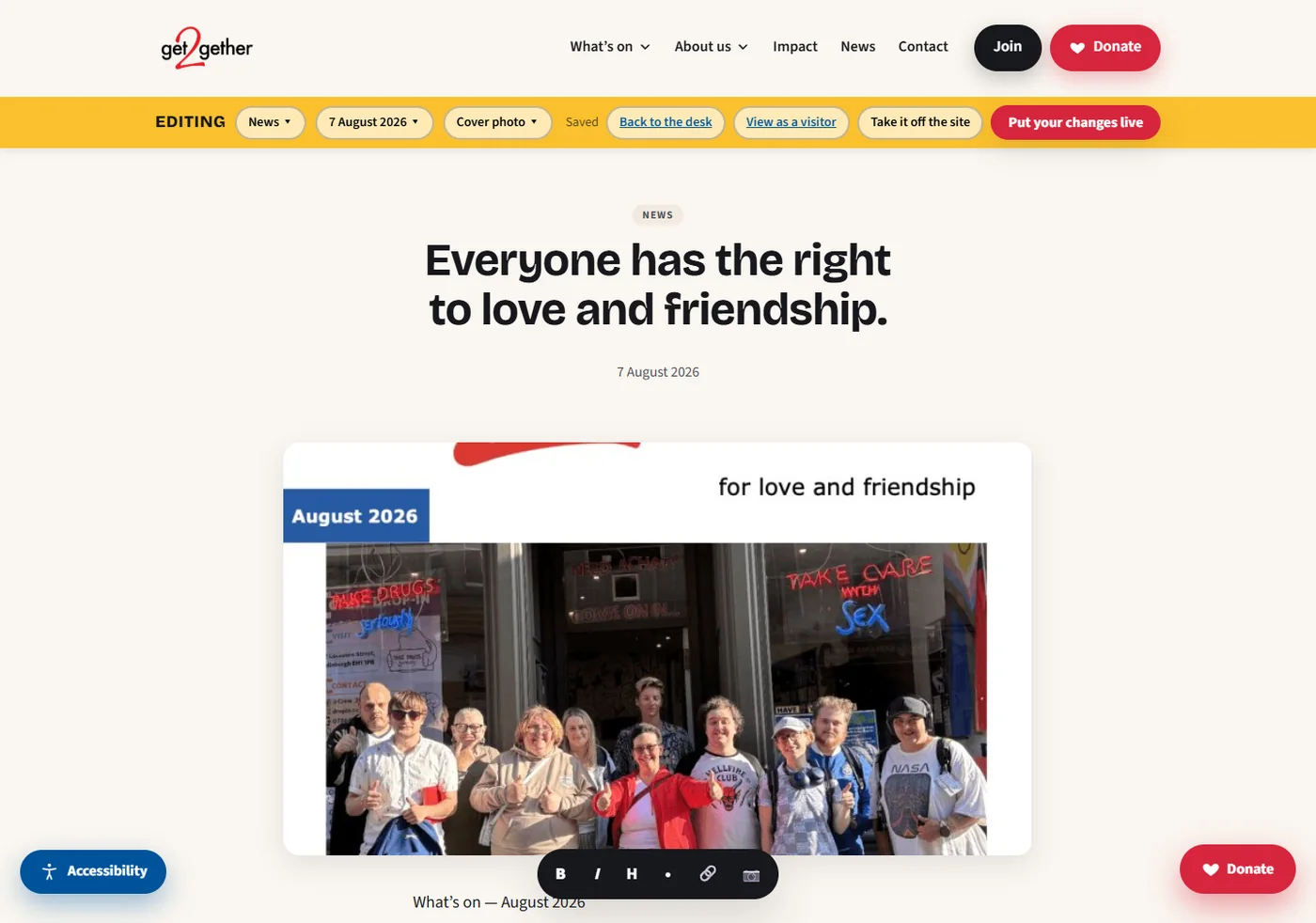
The charity's own website with a yellow editing bar across the top, reading: Back to the desk, View as a visitor, Take it off the site, Put your changes live
The page you edit is the page people see. Click the words, type. The yellow bar is the only difference between editing and visiting — and every button on it says plainly what it does.
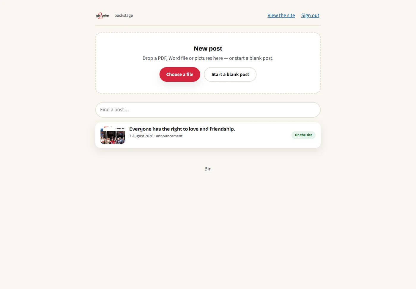
The Backstage desk: a large drop zone reading 'New post — drop a PDF, Word file or pictures here, or start a blank post', a search box, and a list of posts
Drop the monthly magazine PDF in, and the first draft writes itself. They were already making that magazine every month. Now making it is also how the website gets updated.

Changing a sentence, before

  1. Go to a different web address and sign in
  2. Find the right screen among dozens of menus
  3. Type into an editor that looks nothing like your website
  4. Open a preview in another tab to see what it will really look like
  5. Go back. Fix it. Preview again.
  6. Publish, and wait

Changing a sentence, now

  1. Open your own website
  2. Click the words and type
  3. Press Put your changes live

There is no second version of the website to imagine. What you're typing into is the page.

Being straight with you: the new site and this editor are both finished, and the charity hasn't switched over to them yet — that decision is theirs and it isn't made. The three problems further up didn't wait for any of it; I sent those over as soon as I found them.

Curious what yours would show?

I'll look at your website the same way and tell you what I find — whether or not you ever take me up on the free redesign.

Redesign my website — free

Back to all work